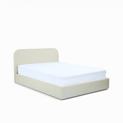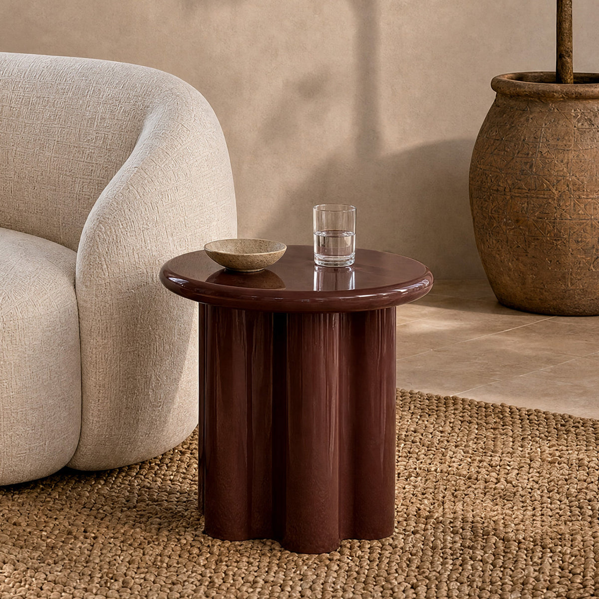
The essentials of warm colors in interior design
- Warm colors are those located on the right-hand side of the color wheel, from red to yellow, passing through orange.
- The 3 main warm colors are red, yellow and orange.
- Their shades include: ochre, burgundy, pink, mahogany, hazelnut, rust, curry, mustard yellow, chocolate, pumpkin and caramel.
- In interior design, warm colors create a feeling of intimacy and closeness, while cool colors give an impression of spaciousness and openness.
- They stand out against a neutral or cool background (white, gray) or alongside their complementary color on the color wheel.
Want some autumnal colors for your interior? Let’s learn how to master warm colors in our interiors with our experts for a vibrant and comforting autumn. From the bedroom to the living room, discover our interior design and home furnishing experts’ tips for embracing warm shades.
What are warm colors and what effects do they have? What are all the warm colors?
Warm colors are all the colors located on the right-hand side of the color wheel, from red to yellow, passing through pink and orange. Their variations include ochre, burgundy, mahogany, hazelnut, rust, curry, mustard yellow, chocolate, pumpkin and caramel.
When looking at the color wheel, warm colors are all those found on the right side of the wheel, starting with red, then pink, moving toward yellow and passing through orange.

What are the three warm colors?
Want to simplify your interior design? Remember that the 3 main warm colors are red, yellow and orange!
Want some warm, autumnal colors for your interior? Let’s learn how to master these warm colors in our interiors with our experts.
According to painter Johannes Itten, a teacher at the Bauhaus and author of the book “The Art of Color”, the color of the surroundings undeniably influences the sensation of warmth.
For example, when a room is painted in cool shades, people in that room experience a sensation of cold (a perceived temperature difference of 2 to 4 degrees compared with the actual temperature, depending on the dominant color).
With increasingly colder temperatures arriving from October onward, it is therefore highly recommended to introduce and prioritize “warm” colors in our décor and interiors. We all want to create, for the long cold months ahead, the impression of warmth and brightness that we will miss. In short, it’s time to pamper ourselves a little!
If we look again at the three main colors in our autumn palette and their variations, we quickly understand that red, orange and yellow, our famous warm colors, have real powers in everyday life. Incorporating them into our décor is therefore both an aesthetic choice and a lifestyle choice, a way of approaching everyday life:
| Warm color | Effect in interior design |
|---|---|
| Red | In interior design, the color red is believed to have a strengthening and comforting effect, |
| Orange | The color orange is creative, cheerful and festive. It creates a convivial, celebratory atmosphere. Is it a coincidence that this color is associated with Halloween today? |
| Yellow | Yellow is, of course, the ultimate color of radiance—the color of the sun and its rays, which we so need to bring into our homes and apartments in autumn and winter! Do you believe in the power of colors? |
At Maison Pavane, we are convinced that even the simplest piece of furniture can greatly improve your well-being through its design and materials! Curling up in soft velvet, or sitting in a chair or sofa dressed in warm shades—what a delightful feeling.
50 shades of warm colors: let them take care of you!
In autumn, nature unfolds the entire palette of warm colors: red, orange and yellow, followed by ochre, burgundy, pink, mahogany, hazelnut, rust, curry, mustard, chocolate, pumpkin and caramel. These comforting shades influence our mood, provide energy and encourage us to warm up our interior décor.
Peek out your window and feast your eyes: autumn is here!
With autumn comes a show of warm colors. Nature and our landscapes become tinged with red, orange and yellow… And as the season progresses, shades of ochre, burgundy, pink, mahogany, hazelnut, rust, curry, mustard yellow, chocolate, pumpkin and caramel join the fireworks… Inevitably, these magnificent colors in comforting (and sometimes delicious) shades will influence our decorating desires! Because did you know that colors have the power to influence our mood and boost our spirits? Warm colors are said to provide energy and comfort.
Need a little autumnal pick-me-up?
At Maison Pavane, we particularly enjoy taking care of you and your interior. Follow our special “autumn colors” guide to turn your home into a cozy, on-trend nest where it feels good to live—and perhaps work remotely—with our special selection of autumn colors. Living room, dining room, open-plan living area: where will you introduce your warm shades?
How can you incorporate warm colors into your interior? What is the warmest color?
To incorporate warm colors into an interior, four rules are enough: place them against a neutral or cool background, dare to use their complementary color on the color wheel, reserve warm shades for rooms where you want a cozy atmosphere, and take the room’s orientation into account.
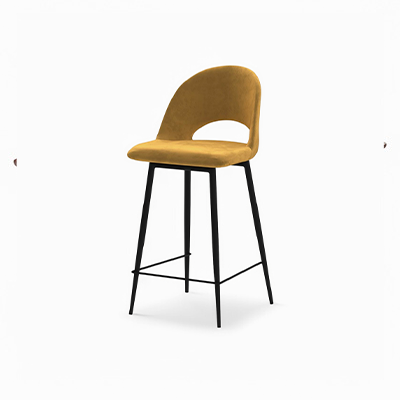
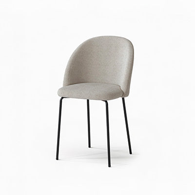
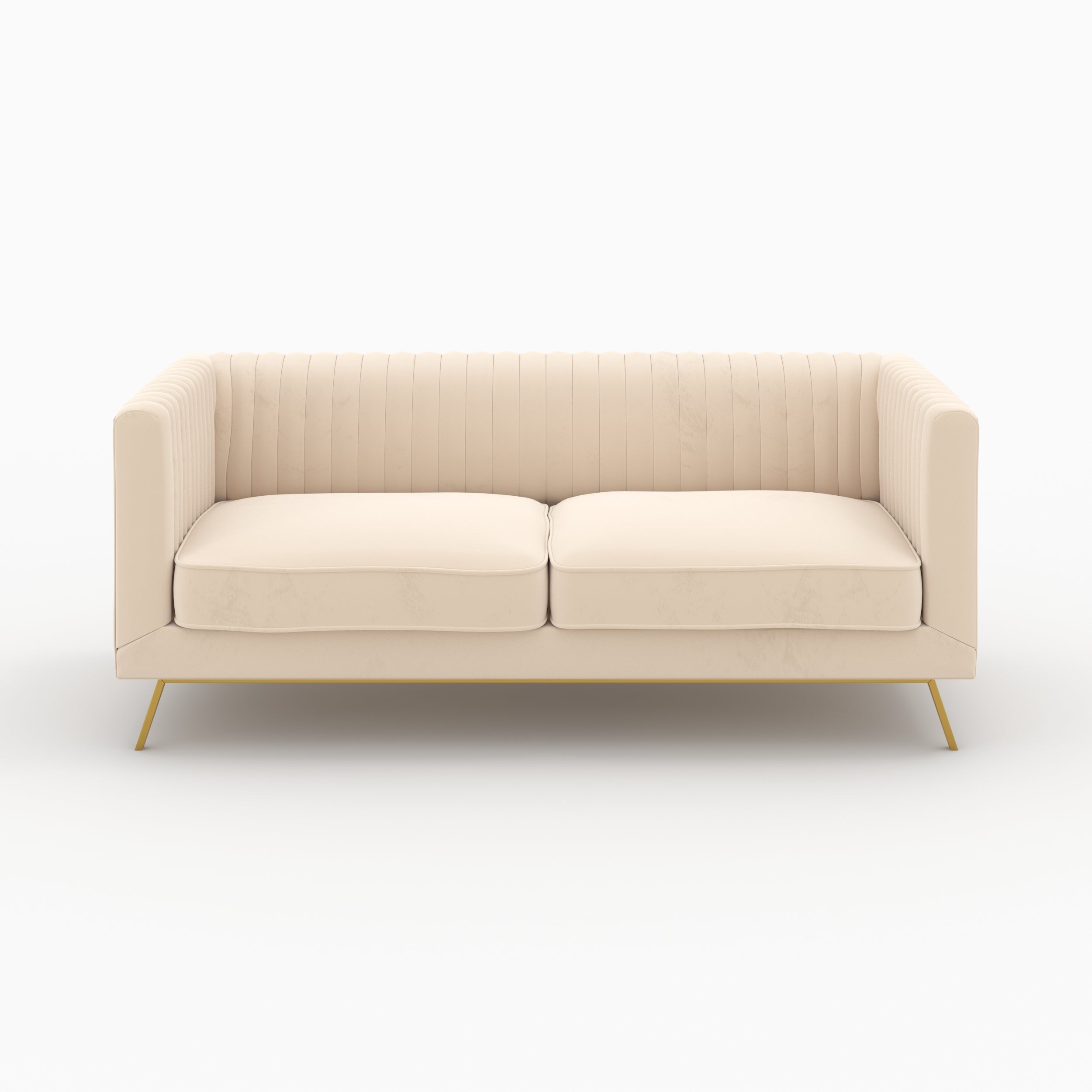
So let’s choose sofas, armchairs, chairs, ottomans, cushions or furniture in shades of red, yellow/ochre and orange to bring a touch of warmth to our décor. To properly incorporate your furniture into this range of both vibrant and invigorating colors, we offer a few basic rules, easy tips and simple decorating advice for using warm or autumn colors in your interior:
- Prioritize placement against neutral or cool tones: set against a cool background, warm-colored furniture and decorative objects will stand out clearly. So, if you want a sofa in shades of yellow/curry/mustard/ochre,
- Consider using a light background (white/gray), or perhaps the opposite color on the color wheel, to make your colors “vibrate” even more: for a piece of furniture, sofa or chair in yellow, you could consider a blue wall or wallpaper! Pairing a color with its opposite on the color wheel creates a vibration: the colors respond to and enliven one another!
- Think about the atmosphere you want to create: in interior design and home furnishing, warm colors create a feeling of intimacy and closeness. Cool colors, on the other hand, give an impression of spaciousness and openness. Consider placing your autumn-colored decorations and furniture in rooms where you want to create a “cozy” atmosphere.
- Don’t forget the location of your rooms: a north-facing, cooler room may happily welcome a piece of furniture or décor in a warm tone. A way to gain a few degrees!
Which rooms can use warm colors?
Warm colors can be incorporated into every room of the house, either as accents or in an all-over look. Today, using color in interior design has become widely accepted, and no one risks a “fashion faux pas” anymore! Warm color palettes are so extensive and often so beautiful that they can easily be incorporated as accents or in an all-over look throughout every room of your sweet home:
- in an entryway for a warm welcome,
- in a living room to add a cocooning touch,
- in a dining room for a festive feel,
- in a kitchen for a convivial atmosphere,
- in a bedroom for intimacy…
How can I combine warm colors with my interior décor? What color makes a living room feel warm?
Warm colors pair well with neutral or cool colors, which balance them out, with geometric patterns (stripes, polka dots, diamonds, triangles), and with exotic woods, natural materials or metals. Online palette tools can help you validate color combinations before purchasing.

As you will have understood, choosing autumnal décor means opting for an interior that is both warm and highly personal! To combine them successfully, here are a few tips:
- To make the best use of them with your existing décor, remember that warm colors can be balanced with neutral colors or cool tones. You will highlight both your existing décor and your latest acquisition: a tip to know before you get started!
- You can also dare to use geometric patterns with brightly colored furniture, such as stripes, polka dots, diamonds or triangles... The contrast between a highly structured geometric pattern and a warm color will give your décor an undeniably bold effect!
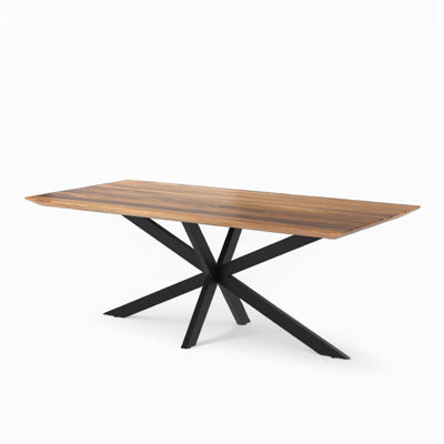
- As for materials, exotic wood (mango/acacia), natural materials (wicker, coconut, rattan, cane, jute fiber) and metals, steel, copper, concrete or marble—“industrial” décor—pair perfectly with warm colors.
- Need a helping hand to combine colors perfectly? Online color palette tools are available! Finding colors that coordinate perfectly with one another is often complex. It would be a shame not to make the right choice when harmonizing your existing décor with a new purchase. Here are two tools that help you find the right combinations and color palettes: LOLcolors and Color Hunt.
Pumpkins on the sofa: when Halloween boosts interior décor!
As October 31 approaches, Halloween’s orange palette makes its way into interior décor: from bright orange to camel, including the shades of squash (squash, pumpkin and butternut). Round, generous shapes, on a light fixture for example, extend the nod to the pumpkin.
In the introduction, we mentioned shades such as “pumpkin,” “chocolate” and “caramel”… For many of us, autumn is also the season when we prepare for Halloween! This Anglo-Saxon celebration has become so popular that an irresistible desire for orange tones takes hold of us as October 31 approaches!
From bright orange to camel, covering the entire range of squash shades (squash, pumpkin and butternut), there is something for everyone.
What if we gave in to the call of these delicious, festive shades to make it through the cold seasons more comfortably? Why not use them in round, generous shapes reminiscent of our famous Halloween pumpkin for a light fixture? Plenty of seasonal inspiration that is easy to arrange, bringing a little festivity into our everyday lives! Autumn colors are here, outdoors and at Maison Pavane: the palette is ready—it’s up to you to make room for your desires and creativity!
Want to learn more about colors?

A few books and documentaries about colors that we have enjoyed at Maison Pavane:
- All the works of Michel Pastoureau,
A medieval historian whose work focuses largely on colors and their meanings:
- The Colors of Our Memories,
- A Color Does Not Come Alone,
- Red: The History of a Color…
- The World of Colors
A 3-episode documentary by Olivier Lassu: the language of colors, the making of colors and the vision of colors, available on the Arte store
- And a little relaxation: colorful films and animated movies:
- La La Land by Damien Chazelle (2016),
- The Young Girls of Rochefort by Jacques Demy (1967),
- The Grand Budapest Hotel by Wes Anderson (2014),
- Rio by Carlos Saldanha (2011),
- The Red Shoes by Michael Powell and Emeric Pressburger (1948),
- The Red Turtle by Michael Dudok de Wit (2016)
FAQ: warm colors in interior design
What are warm colors?
Warm colors occupy the right half of the color wheel, from red to yellow, passing through pink and orange. They include ochre, burgundy, mahogany, hazelnut, rust, curry, mustard yellow, chocolate, pumpkin and caramel.
What are the 3 main warm colors?
Red, yellow and orange. Red is considered strengthening and comforting, orange creative and festive, and yellow the color of radiance and sunshine.
What are vibrant colors in interior design?
In this article, vibrant colors refer to the range of warm colors, both radiant and invigorating: red, yellow, ochre and orange, used on a sofa, armchair, chair, ottoman or cushions to warm up an interior.
What is the difference between warm and cool colors?
In interior design and home furnishing, warm colors create a feeling of intimacy and closeness. Cool colors, on the other hand, give an impression of spaciousness and openness.
What color makes a living room feel warm?
A warm living room features touches of red, yellow, ochre or orange set against a light, white or gray background. A sofa, armchair or cushions in these shades add the desired cocooning feel without overwhelming the room.